X-Fonter 14.0
Image & Effect Studio
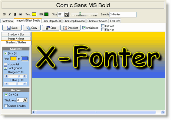
The Image & Effect Studio is the second tab of the Font Detail Panel. It lets you render your sample text as a styled image — with effects such as drop shadows, gradient fills, outlines, blur and mirroring — and then copy that image directly to the clipboard or save it as a file. No external graphics application is needed, and the font does not have to be installed on your system.
This makes the Studio useful both for evaluating how a font will look in a real design context and for producing finished header or logo graphics to drop straight into a project.
Entering Your Text
Type the text you want to render in the Sample edit box at the top of the tab. The preview canvas updates instantly as you type. Only one line of text is supported in the Studio — for multi-line previews use the Font View tab instead.
The font, style and size used are taken from the settings in the Control Panel at the top of the Font Detail Panel. Change those settings and the Studio preview updates automatically.
The Three Effect Panels
On the left side of the tab are three collapsible panels, each controlling a pair of related effects. Every control updates the preview in real time as you adjust it — the best way to understand the range of each effect is to move the sliders and watch the result.
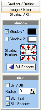
Panel 1 — Shadows & Blurring
Shadow adds a drop shadow behind the text. You can control the shadow colour, its horizontal and vertical offset from the text, and the spread (softness) of the shadow edge. A tight, dark shadow close to the text reads as a subtle lift effect; a wide, light shadow at a larger offset reads as a floating or embossed effect.
Blur applies a Gaussian blur to the entire rendered image, including any effects already applied. At low values this softens hard edges and gives the image a slightly anti-aliased quality; at higher values it creates a focus or glow effect. Blur is applied after the other effects, so it affects shadows and gradients as well as the text itself.
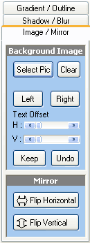
Panel 2 — Background Image & Mirroring
Background Image lets you place an image file behind the text so you can preview how the font looks against a real background — for example, a photograph or a texture you intend to use in your design. Click the folder icon to browse for an image file. The background is scaled to fill the canvas.
Mirroring flips the entire rendered image horizontally, vertically, or both. This is useful for creating reflection effects or for checking symmetry in display typefaces.
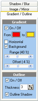
Panel 3 — Gradient Colors & Outlines
Gradient Colors replaces the flat fill of the text with a smooth colour gradient. You can set the start and end colours and the direction of the gradient (top-to-bottom, left-to-right, or diagonal). Gradients are most effective on large, bold typefaces where the fill area is wide enough to show the transition clearly.
Outlines draw a stroke around the outside of each glyph. You can set the outline colour and thickness. Outlines are particularly useful for ensuring legibility when text is placed over a busy or patterned background.
Top Toolbar Controls
| Control | What it does |
|---|---|
| Save | Saves the current canvas as an image file. You can choose between JPEG (best for photographic backgrounds), GIF (best for flat colours and transparency), and PNG (lossless, supports transparency — usually the best general-purpose choice). If a selection is active, only the selected area is saved. |
| Copy | Copies the image to the Windows clipboard so you can paste it directly into any application that accepts images (Word, Photoshop, PowerPoint, and so on). If a selection is active, only the selected area is copied; otherwise the entire canvas is copied. |
| Crop | Trims the canvas to the current selection, discarding everything outside it. Use this to remove unwanted whitespace before saving, or to isolate a single character or word from a longer string. |
| Deselect | Clears the current selection marquee without changing the image. After deselecting, Copy and Save will act on the entire canvas again. |
| Antialias | Smooths the edges of the rendered glyphs by blending pixels at boundaries. Leave this on for most uses — it produces cleaner results especially at smaller sizes. Turn it off if you need sharp pixel-exact edges, for example when creating graphics for pixel-art or retro-style projects. |
| Flip Horizontal / Flip Vertical | Mirrors the entire canvas in the selected direction. These controls work on the whole image at all times, independently of any active selection. |
Making a Selection
Click and drag on the preview canvas to draw a selection rectangle. The selection is shown as a dashed marquee border. Once a selection is active:
- Copy copies only the selected area to the clipboard.
- Save saves only the selected area to a file.
- Crop trims the canvas to the selection.
Click Deselect or click anywhere outside the selection on the canvas to clear it.
Common Scenarios
Creating a title graphic for a web page
- Type your page title in the Sample box.
- Set a gradient in Panel 3 using your brand colours.
- Add a subtle shadow in Panel 1 for depth.
- Enable Antialias for smooth edges.
- Click Save and choose PNG to preserve any transparency.
Mocking up a logo against a real background
- In Panel 2, load a background image from your project folder.
- Adjust the font size and colour in the Control Panel until the text is legible against the background.
- Try adding an outline (Panel 3) if contrast is low.
- When satisfied, use Copy to paste the composite directly into your design application.
Evaluating a font at display size before installing it
- Browse to the font file in the Browse tab — no installation needed.
- Switch to the Image & Effect Studio tab.
- Set a large size (60–120 pt) in the Control Panel.
- Enable gradient and shadow to simulate the finished look.
- Compare multiple fonts by selecting each in turn — the effects settings are preserved as you switch.
Related Topics
- Font View — preview multi-line text and use pangram presets without effects
- Font Detail Panel — overview of all six detail tabs and the Control Panel settings that feed into the Studio
- Browse & Find Fonts — preview and use fonts from the Studio without installing them first
Copyright © 2001-2026 Blacksun Software. All Rights Reserved