X-Fonter 14.0
Font Detail Panel
The Font Detail Panel occupies the right-hand side of the X-Fonter window and updates automatically whenever you select a font in any tab. It gives you a complete picture of the selected font in one place: how it looks at different sizes, which characters it contains, any special effects you can apply to it, and the technical metadata stored inside the font file itself.
Panel Layout
The panel is organised into three stacked areas:
- Font Name header — displays the name of the font currently being previewed. In dual-pane (compare) mode, this header appears for both fonts and highlights the active one in blue. This header is optional and can be hidden in Options.
- Control Panel — lets you adjust how the preview looks: font style (regular, bold, italic, bold-italic), foreground and background colours, and display size. Changes here apply instantly across all six detail tabs.
- Detail tabs — six tabs, each providing a different view of the font. Described in full below.
Single-Pane and Dual-Pane Mode
By default, the panel shows one font at a time (single-pane mode). The font displayed always matches whichever font is selected in the font list on the left.
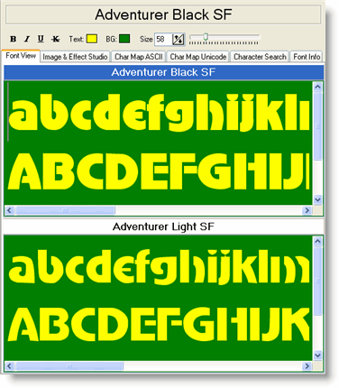
Switching to dual-pane mode splits the detail area vertically so you can compare two fonts simultaneously — for example, to check whether two typefaces pair well together, or to spot differences between a Regular and a Bold weight. To change the active font in dual-pane mode, click its name in the header; the active font's header turns blue. Changes made in the Control Panel apply to the active font only.
The Control Panel
The Control Panel sits between the font name header and the detail tabs and contains the following settings:
- Style — switch between Regular, Bold, Italic, and Bold Italic. If the font does not include a true bold or italic variant, Windows will simulate one; a small indicator shows when a style is simulated rather than native.
- Size — set the preview size in points. You can type a value directly or use the up/down arrows. The size applies to all tabs simultaneously.
- Foreground colour — the colour used to render the font glyphs in the preview.
- Background colour — the preview background colour. Switching to a dark background is useful for checking how a font performs on dark UI themes or printed on coloured stock.
The Six Detail Tabs

| Tab | What it shows |
|---|---|
| Font View | Type your own sample text and see it rendered immediately in the selected font. Useful for testing how a font handles specific words, phrases, or letter combinations that matter for your project. The text and size you enter are preserved as you move between fonts, making quick comparisons easy. |
| Image & Effect Studio | Apply visual effects to your font sample — including drop shadows, blurring, and gradient colouring — and see the result in real time. The finished image can be copied to the clipboard or saved as a JPEG or GIF file, ready to use in a mockup or presentation. |
| Char Map ASCII | Displays all 256 ASCII characters in a grid, rendered in the selected font. Click any character to see it enlarged and to copy it to the clipboard. Useful for quickly checking whether a font covers the punctuation and symbols you need, or for picking a decorative character to use in a design. |
| Char Map Unicode | Shows the full Unicode character coverage of the font, organised by Unicode block (Latin Extended, Greek, Cyrillic, currency symbols, arrows, and so on). Unsupported characters are shown as empty cells, making it immediately clear which scripts and symbol sets the font can handle. |
| Character Search | Search for a specific character by name (for example "em dash" or "copyright") or by its Unicode code point number. The matching character is highlighted in the Unicode grid so you can see exactly how the font renders it. |
| Font Info | Displays all the metadata embedded inside the font file: designer name, copyright notice, version number, supported code pages, embedding permissions, and low-level metrics such as ascender, descender and x-height values. Particularly useful for checking licensing terms before using a font in a commercial project. |
Common Uses
Checking a font for a specific language
Open the Char Map Unicode tab and scroll to the Unicode block for the script you need — for example, Cyrillic or Greek. Any character the font cannot render will show as a blank cell. If coverage is incomplete, check the Font Info tab for the list of supported code pages to confirm which languages are officially supported.
Comparing body text legibility at small sizes
Switch to dual-pane mode, assign one font to each pane, open Font View in both, and type a paragraph of representative text. Set the Control Panel size to your intended body size (typically 9–12 pt) and compare spacing, x-height, and overall readability side by side.
Creating a quick title graphic
Select your font, type the title text in Font View, then switch to the Image & Effect Studio tab. Apply a gradient and shadow, then copy the result directly to the clipboard to paste into your design application — without leaving X-Fonter.
Related Topics
- Font View — type and preview your own sample text
- Image & Effect Studio — apply effects and export font images
- ASCII Character Map — browse and copy ASCII characters
- Unicode Character Map — check Unicode coverage by block
- Character Search — find a character by name or code point
- Font Information — read embedded font metadata and licensing
- Options — show or hide the font name header, and set default preview sizes
Copyright © 2001-2026 Blacksun Software. All Rights Reserved