X-Fonter 14.0
Font View
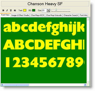
The Font View tab is the first tab in the Font Detail Panel and is the quickest way to judge how a font looks in practice. Type any text directly into the edit box and it is rendered immediately in the selected font, at whatever size and colour you have set in the Control Panel. As you move between fonts in the font list, the same text is redrawn in each new font so you can compare them without retyping anything.
Your sample text is saved automatically and restored the next time you open X-Fonter, so you can set up the exact phrase or heading you are working on and pick up where you left off.
Typing Your Own Sample Text
Click anywhere inside the edit box and start typing. The preview updates with every keystroke. A few things worth knowing:
- The edit box accepts multiple lines. Press Enter to start a new line, which is useful for previewing how a font handles both a headline and body text at once.
- You can paste text from the clipboard with Ctrl+V, so it is easy to drop in an actual headline or paragraph from a project you are working on.
- Copying text out of the edit box (Ctrl+C) copies the plain text only — font, colour and size are not carried across. To export a styled image of the text, use the Image & Effect Studio tab instead.
Dual-Pane Mode: Comparing Two Fonts
Switching to dual-pane mode splits the Font View vertically into two independent preview areas, each showing a different font rendering the same sample text simultaneously. This is the fastest way to decide between two similar typefaces.
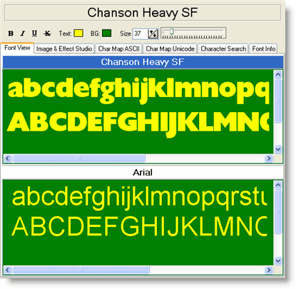
To enter dual-pane mode, press Ctrl+D or go to View → Font Compare in the menu. Press the same shortcut again to return to single-pane mode.
In dual-pane mode:
- The text entered is always identical in both panes. Typing in one pane automatically updates the other.
- The active pane is the one that responds to font selections in the font list on the left. It is identified by a highlighted (blue) header bar. Click a pane's header to make it active.
- Style, size and colour changes made in the Control Panel apply to both panes at the same time.
Step-by-step example
- Press Ctrl+D to enter dual-pane mode.
- Click the upper pane header to make it active.
- Select your first font (for example, Georgia) in the font list.
- Click the lower pane header to make it active.
- Select your second font (for example, Palatino Linotype) in the font list.
- Both fonts now render the same sample text — adjust the size in the Control Panel to preview at your intended body or heading size.
Preset Sample Texts
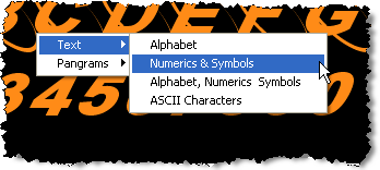
Right-clicking inside the edit box opens a context menu with a library of ready-made sample strings. These save time when you want a consistent test across many fonts and do not need to type anything yourself. The presets are divided into two groups.
1 — Predefined character sets
| Preset | Contents |
|---|---|
| Alphabet | Both cases of the Latin alphabet on two lines — good for a quick overview of
letterform consistency.
abcdefghijklmnopqrstuvwxyz
ABCDEFGHIJKLMNOPQRSTUVWXYZ |
| Numerics & Symbols | Digits and common punctuation across three lines — useful for checking number
style and symbol coverage.
1234567890.
!@#$%^&*()_+
[]{}\|;:,<> |
| Alphabet, Numerics & Symbols | The two presets above combined into a single block — a comprehensive first look at how a font handles all the most common characters. |
| ASCII Characters | All printable ASCII/ANSI characters in code-point order — the most thorough
single-screen test of basic character coverage.
!"#$%&'()*+,-./0123456789:;<=>?
@ABCDEFGHIJKLMNOPQRSTUVWXYZ[\]^_
`abcdefghijklmnopqrstuvwxyz{|}~ |
2 — Pangrams
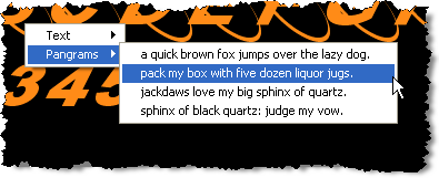
A pangram is a sentence that contains every letter of the alphabet at least once. Pangrams are the standard tool for evaluating how a font handles the full range of letterforms in a natural, readable context — unlike a raw alphabet string, they show how letters interact with each other in real words.
X-Fonter includes several pangrams to choose from. Selecting any one of them replaces the current edit box content with that pangram immediately. The classic English example is "The quick brown fox jumps over the lazy dog", but several alternatives are provided so you can pick one whose letter distribution or visual rhythm suits your preview needs.
Related Topics
- Font Detail Panel — overview of all six detail tabs and the Control Panel settings
- Image & Effect Studio — apply shadow, blur and gradient effects to your sample text and export as an image
- ASCII Character Map — browse all 256 ASCII characters in a grid and copy individual glyphs
- Unicode Character Map — check which Unicode blocks and scripts the font supports
- Keyboard Shortcuts — full list of shortcuts including Ctrl+D for dual-pane toggle
Copyright © 2001-2026 Blacksun Software. All Rights Reserved